Report Tables: Progress change columns
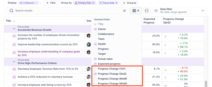
In your weekly, monthly, quarterly, and annual strategy reviews, it’s very useful to demonstrate how the progress on your goals has changed since you last checked in. To incorporate this information, we recommend adding one of our progress change columns into your tables in Reports.

We offer four column options for displaying progress change:
- Progress Change (WoW)
- Progress Change (MoM)
- Progress Change (QoQ)
- Progress Change (YoY)

Understanding the progress change calculation
To understand the calculations happening in these columns, let’s assume today is Wednesday, August 28th, 2024. Here is how the progress change will be calculated for each different time period:
|
Column |
Calculation |
Today’s Date |
Comparison Date |
|
Progress Change (WoW) |
Difference between progress today vs. progress one week ago |
Wednesday, Aug 28th, 2024 |
Wednesday, Aug 21st, 2024 (1 week prior) |
|
Progress Change (MoM) |
Difference between progress today vs. progress one month ago |
Aug 28th, 2024 |
July 28th, 2024 (1 month prior) |
|
Progress Change (QoQ) |
Difference between progress today vs. progress one quarter ago |
Aug 28th, 2024 |
May 28th, 2024 (3 months prior) |
|
Progress Change (YoY) |
Difference between progress today vs. progress one year ago |
Aug 28th, 2024 |
Aug 28th, 2023 (1 year prior) |
Note: If you select a comparison period that predates the start date of a goal, the column will display the total progress change since the goal’s start date. For example, when reporting on Progress Change (YoY) for a goal that only began 6 months ago, you will see the total progress change over the past 6 months (since the goal's start date).
Progress change icon & colors
Every goal will have an "up" arrow or "down" arrow shown in the Progress Change column indicating if you're getting closer to, or further away, from your target. An "up" arrow indicates you are approaching your target. This is good change and is color-coded green. A "down" arrow indicates that you are getting further away from your target. This is a bad change and is color-coded red.
For Objectives, Projects, and Actions, an increase in progress will always be “good” (green) as it means you are getting closer to your target of 100% completion.
For Measures, the definition of “good” and “bad” changes will vary based on how you’ve configured your Measure and what you’re trying to achieve. For example, you may want to increase your total output volume, in which case an increase would be “good” (means you are approaching your reach target). On the other hand, you may want to decrease your total costs, in which case a decrease would be “good” (means you are successfully reducing the actual value). Below are a couple of examples you can reference if you’re trying to better understand why something is displaying as "good" vs. "bad" in the table:
|
Measure |
Initial Value |
Target Value |
Higher/Lower is Better |
Color Output |
|
Reach total revenue of $100M in 2024 |
$0 |
$100M |
Higher is better |
Increase = good Decrease = bad |
|
Reduce bounce rate from 35% to 30% in Q3 |
35% |
30% |
Lower is better |
Increase = bad Decrease = good |
|
Stay below total costs of $850k in 2024 |
$0 |
$850k |
Lower is better |
Increase = bad Decrease = good |
Progress change for Maintain measures
For Maintain measures, the color coding for progress change will work as such:
- For Maintain Above measures, higher is better, so increases are by definition "good" (getting you closer to/exceeding your threshold) and decreases are "bad"
- For Maintain Below measures, lower is better, so increases are by definition "bad" and decreases are "good"
- For Maintain Between measures, there are upper and lower bounds you want to stay between. The least risky place to be in this situation is right in the middle! The closer you move towards the upper or lower bound of your measure, the more at-risk you are of going off track. So, for these measures, moving further away from the midpoint of your bounds is "bad" and moving closer to the middle point of your bounds is "good".