While there are a couple of quick widgets, custom charts provide a BI-Tool alike experience and complete flexibility to help you conduct in-depth analysis by slicing and dicing different types of data, and provide a visual insight with bar, line and pie charts. The different chart types pull up the health or progress of each data all the way from a single KPI to performance of strategic portfolio, thereby letting you deep dive into how aligned you’re with the organization's vision.
While it’s not mandatory to use custom charts, its ability to aggregate data from various data sources helps you with:
-
Flexibility
-
Alignment
-
Observability
-
Performance management
-
Drive strategic decisions
There is a very wide scope of use cases when it comes to building custom charts. It is best to be used when you want to have complete flexibility to conduct an in-depth analysis. You can build custom charts to get insights like
-
best performing plan
-
performance management - team(s) or individuals, and compare workloads
-
project analytics (see Custom Charts: Project Analytics for details)
-
track a team's metrics or KPIs
-
the health of your tasks or projects
-
health or performance of different owners to understand workload and make data-driven decisions for resource allocations.
-
progress trend of different metrics over time
-
understand the correlation between: actions and measures, or teams and actions, or focus areas and objectives, or any combination of data sets that you wish.
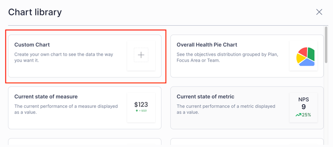
In a Report, Click Chart > Custom Chart,
The chart takes the default title "Custom Chart". Click on it to edit the name of the chart. Select the type of chart that you wish - Bar, Line, Double y-axis Line, or Pie charts.
In most cases, a
-
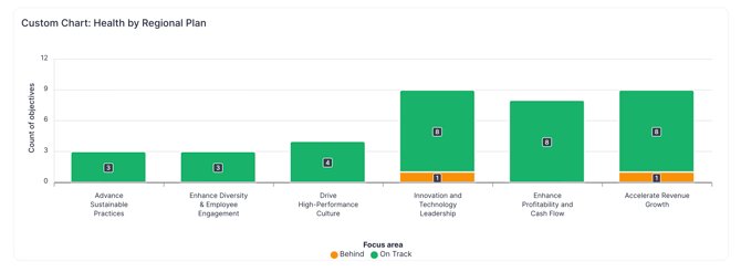
bar chart is built when looking at the performance across a plan by focus areas, or to understand how individual team members are doing on their respective goals,
-
line chart is built for looking at how revenue has progressed over a time period, or the number of tools manufactured in a quarter,
-
double y-axis line chart is built to look at how the funding allocations on a goal is distributed across projects, or to understand the profit margin vs the net debt ratio,
-
pie chart is built to look at how the progress or performance is sliced across entities.
You can filter the data based on health, types, etc., to focus on the specific visuals.
You can filter by Types only if you've them added in your workspace. Also, you cannot filter by Types if Plan or Focus area is chosen as data source. Note that, if you're building the double y-axis chart, the data sources need to be the same (e.g. comparing a measure with another measure, not an action).
How to interpret the data from these charts?
Hover the mouse over the charts to see the progress over different dates.
-
In the case of "line", or "double y-axis line" charts, or when you've chose time in x-axis in a "bar chart", then
-
you can change the date or time (hourly, daily, etc.) ranges by clicking on those components, and view the real-time changes in the chart.
-
Also, in these charts, if you chose Average measure (Actual value of measure) in the data arrangement section, then you can toggle the Show target switch to display the target in the charts. This helps you understand how the performance is with respect to the target, and lets you decide further.
-
-
-
With line charts, or when time is chosen in x-axis of bar charts,
-
if you wish to see how your data progressed when compared to a period back in time, then you can click Compare to, and select either year on year, month on month or week on week, and the number of periods to see the visualization accordingly.
-
If you're tracking your company's financial performance like the ARR, market share, net profit, or sales' revenue generated, this "compare to" feature will let you understand the historical trend, and guide you in decision-making.
-
In these cases, you can toggle the Display Numbers option to see the progress on the chart itself instead of hovering over to look at them.
-
-
Furthermore, with bar charts, you've the option to look at the performance of your measures or metrics at a very granular level, i.e.,
-
when you choose Average progress of measures (%), or Average measure (Actual value of measure) in y-axis, then the Non-cumulative and Cumulative options are displayed which lets you to decide how to represent the measure's progress over time.
-
To help you understand how your measure progressed individually every day, week, or month, like in website's performance, number of tickets handled, NPS, etc., selecting non-cumulative option gives you the clear picture.
-
When you've not entered any actual value for a measure, then the Non-cumulative option will exclude that measure for average measure or average progress of measure calculations. However, when you've manually entered 0, it'll consider for calculation.
-
-
With any of these charts, if you're looking at the count or average progress of objectives in a plan, it'll include the shared objectives in that plan as well. However, the data on the nested objectives will still not be included.
-
In each of these charts except in Pie charts, you can toggle the Display Numbers option to show the values on the chart itself instead of you hovering the mouse over them to look at them or viewing from the context table.
-
Use the sort by dropdown to sort the data in the chart - Ascending (lowest to highest values), Descending (Highest to Lowest values), A to Z (sort alphabetically the entity, i.e., objective/measure/team/owner), or click Default to revert to the initial visual in case of Bar and Pie charts.
-
With pie charts, hover the mouse over it, or click on the pieces of the pie to see the breakdown of data for each slice.